Insulin on Board – Data Rep Final Project
 I have completed Insulin on Board, my final project for the Data Representation class at ITP. Insulin on Board is a part of Databetes, my project focused on using data to improving diabetes health outcomes. As a type-1 diabetic of 25 years, I know first-hand that patients need greater support in making all the daily decisions that affect their blood sugar control. A PDF version that shows the whole piece can be seen at http://bit.ly/KRTCzP
The goal of Insulin on Board was to better understand the relationship between the insulin I take and the resulting blood sugar readings. It visualizes not simply when I take a dose of insulin, but when that insulin “kicks in.” Because insulin has a latency, it is helpful to see it actually has an effect on blood sugar. Often times I’ll take two or more doses of insulin within a few hours. Insulin on Board calculates the sum overlapping effect of these dosages.
I used 100 days of my own medical data for this project, spanning from January 1 to April 9, 2012. During this time range, I delivered 820 dosages of insulin and produced 25,012 blood sugar readings. Readings were exported from my insulin pump and continuous glucose monitor software in CSV or XML format. One benefit of building my own program is being able to see all the data from two different brands of devices . This is currently impossible because each manufacturer’s proprietary software is incompatible with the other.
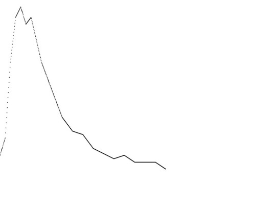
The visualization graphed the actual efficacy of my insulin (Humalog) rather than just the times that doses were given. There are many types of insulin on market and each has a different latency. Below is a graph of Humalog’s effect, taken from the website of the producer, Eli Lilly.
 With some guidance from Dan Shiffman, I began by turning this into an array of efficacy values over the 480 minutes it is active.
 Working with Processing, I first plotted with a circle at each minute point.
 Then, I changed this graph noting the size of dosages by the height of the line…
 Refining the fill and looking at a longer time view produced this:
 Turning my attention to my blood sugar data, I then imported and graphed this data.
 A more detailed look gives you this:
At this point, I went off on a tangent. Seeking to simplify the 25,000+ blood sugar readings, I was curious how the data would look like in binary form. I drew a black line only if the readings were in range (80-140 mg/dL). High or low blood sugar readings remained white. Here is a broader view over time…


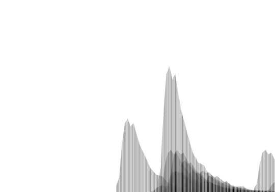
 I then took all the January readings, adjust the opacity and stacked them on top of each other to produce this overview of my average day that month:
 Next, I broke it down by average January weekday and weekend. The weekday view shows more times in range…
 Returning to the insulin dosage data, it look me a little while longer to sort out the code for generating a sum total for the actual insulin taking effect at any minute. Since taking multiple dosages with an insulin pump is so easy, I often times will take multiple dosages within a short time frame. Sometimes this is because of the food I am taking. When I eat pizza for example (which is quite rare), I will take a few dosages over the course of a few hours to match how that food is digested. With some additional help from my teacher Jer Thorpe and the ITP residents Patrick Hebron and Rune Madsen, I finally sorted out the sum. This is an early iteration that brought these three different displays of data together. The red line notes the total insulin on board:
Now that I had effectively parsed all the data and generated the additional readings that I was after, I still struggled with the best way to show the information as a final product. I considered going a more artistic route. This was inspired by the look of the insulin dosages when they overlapped with the opacity adjusted. It reminded me of Chinese paintings. I experimented with playing off this aesthetic, but could never get it to look quite so digital.
If I was using Photoshop instead of Processing, I would have smoothed and blurred the readings to ease away the edges. I did generate this view in Photoshop by mirroring the image, adding some filters and adjusting the tones.
 Bringing in the blood sugar readings again (first very crudely)
 I then moved the readings down, with the line of readings erasing the mirror.
 Then I began messing around with colors to denote the readings.
But I still wasn’t getting what I was after. I wanted something that was interesting to look at even if you didn’t know anything about diabetes. Yet I also wanted it to help me understand this relationship between the insulin and blood sugar readings.
So I look another look at just the blood sugar readings and played more with the color.
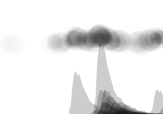
 Then I decided to simplify the readings more and highlight only the problem readings where my blood sugar went high. I did this by making the circles bigger and further out the higher the reading:

 Finally, I was getting somewhere. I decided to flip the readings so that the circles moved down as they got bigger. While this is somewhat counter-intuitive to have higher readings get lower on the page, it would also allow for overlap with the large insulin dosages spiking on the page.
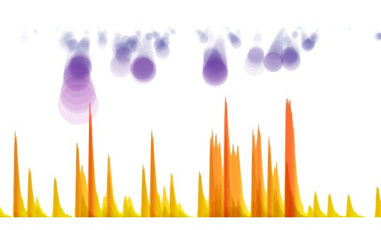
 Yet I still hadn’t integrated the total insulin on board sum readings. To begin, I decided to create what I called a heat map along the bottom. It ranged from yellow (low amounts of insulin taking effect) to red (large amounts).
 I contemplated making this my final version in part because I liked the interplay of colors (cold at top, black & white in the middle, warm along the top) and data. But in the end, I decided to make the yellow/red graphic show the sum of the individual gray readings.

 I lowered the opacity a bit so that you could still see the individual readings below if you looked closely.
 I like how it looks with all 100 days of data laid out wide & narrow.
 I will soon publish my Processing code on Github. I just want to review it and perhaps clean it up a bit too.
In general, I am happy with the result of this process. I put a lot of time into making this visualization and started coding pretty soon after it was assigned. I feel like I’ve gotten better at understanding the logic of programming this type of project. I’m also getting a bit quicker on executing too. Additionally, I was able to use Java’s SimpleDateFormat to synchronize multiple data sets that had different style time stamps.
As for my feelings about my diabetes having seen the data presented this way, this project shows me that a low-carb diet is very effective. More often than not, the spikes in blood sugars were related to meals with higher carb totals. After decades of not eating this way, it appears I have one more reason to switch my diet up more.
There of course is plenty more work to be done in the data visualization department when it comes to Databetes and my medical data. This exercise was very helpful for me both as a patient and as a relatively new coder learning to process big data sets. And it is great to be able to generate these massive displays. But to be more practical, I also need to experiment with effectively showing the data on much smaller real estate like a mobile phone. Mobile health will be huge in the (hopefully not-too-distant) future. I think patients like me could benefit massively from having improved visualizations that give you both a solid overview of how you are doing but also allow you to dial down into the details if you want. Additionally, I will also need to learn to integrate even more data sets for things like food and exercise. This will require an additional level of design thought to bring in those readings and show their effect.
For those of you in New York, this project will be in the ITP Spring Show happening May 14 & 15. See here for more details. I made a 10′ long print of the visualization and am considering other additions that could work to enhance the display in person.


This was a freaking amazing post. I found it when @krees linked to your work. I loved the detail, and the use of design tools along with the data tools. Keep up the awesome work!
Thanks, Lynn!
This is fantastic. Way better than my own (extremely feeble) attempts at visualizing and understanding my data. Let me know if you’re in the Boston area–would love to meet you and hear more about your work.